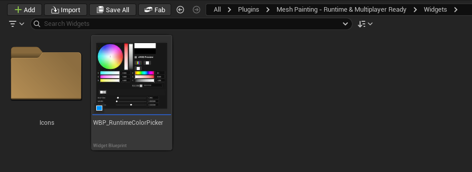
WBP_RuntimeColorPicker
WBP_RuntimeColorPicker is the default runtime color picker widget included with the plugin.
It is designed to work directly with PaintingModeControllerComponent. When paint mode opens, the controller creates the widget, adds it to the viewport, and passes itself to the widget through the runtime paint target interface.
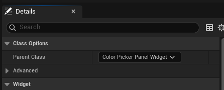
Parent Class
The parent class is Color Picker Panel Widget, implemented in C++ as UColorPickerPanelWidget.
Keep this parent class when making custom versions. The parent class owns the actual color picker logic:
- Current and previous color state
- RGB, HSV, and hex synchronization
- Brush size, metallic, and roughness values
- Eraser state
- Eyedropper mode
- Recent color history
- Tool strip behavior
- Paint target integration
- Blueprint events
Recommended Custom Workflow
Do not build a custom color picker from an empty widget unless you are intentionally replacing the whole UI system.
The recommended workflow is:
- Find
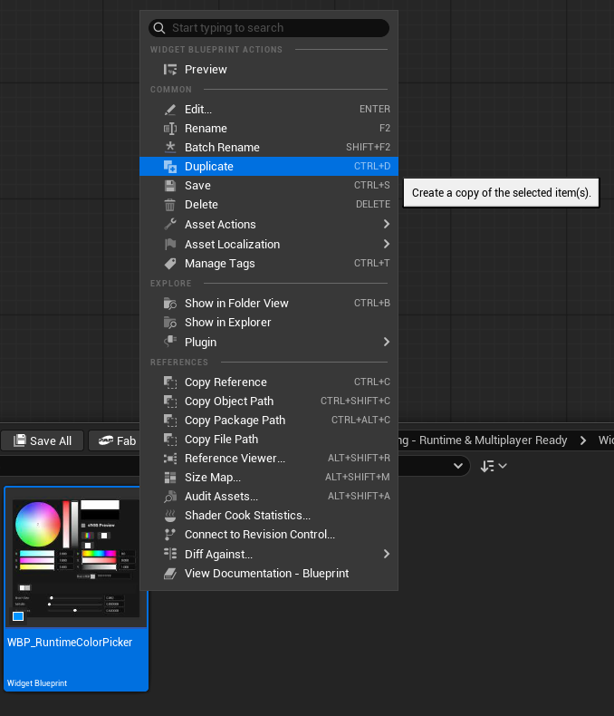
WBP_RuntimeColorPicker. - Duplicate it.
- Rename the duplicate, for example
WBP_MyRuntimeColorPicker. - Keep the parent class as
Color Picker Panel Widget. - Change the layout, colors, padding, icons, fonts, and visual style.
- Keep the bound widget names unless you intentionally remove that feature.
- Assign the duplicated widget to
PaintingModeControllerComponent > Widget > Color Picker Widget Class.
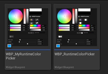
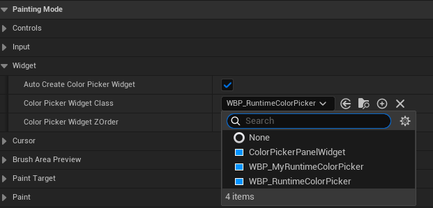
This keeps the C++ event binding, brush setting sync, eyedropper, eraser, and recent color behavior intact.
Designer Overview
You can freely restyle the duplicate widget in the Designer.
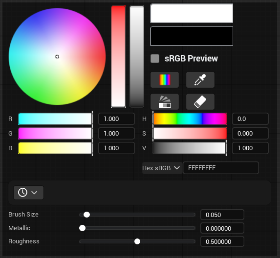
Safe changes:
- Move panels around.
- Change colors, backgrounds, borders, and padding.
- Resize rows and previews.
- Replace icons and styling.
- Hide optional sections you do not need.
Risky changes:
- Renaming bound widgets.
- Deleting a bound widget but expecting its feature to keep working.
- Changing the parent class.
- Replacing plugin child widgets with normal UMG widgets that do not expose the expected events.
Important Widget Names
UColorPickerPanelWidget uses optional widget binding. That means the widget can still build a native fallback layout if nothing is provided, but a custom Blueprint should keep these names when it wants the built-in behavior.
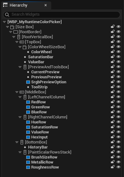
| Widget Name | Expected Type | Purpose |
|---|---|---|
RootBorder | Border | Main panel area, padding, and cursor-over-UI detection. |
ColorWheel | Color Wheel Widget | Hue/saturation or spectrum color selection. |
SaturationBar | Vertical Color Bar Widget | Saturation adjustment in wheel mode. |
ValueBar | Vertical Color Bar Widget | Value/brightness adjustment. |
CurrentPreview | Color Preview Widget | Shows the current color. |
PreviousPreview | Color Preview Widget | Shows and restores the previous color when clicked. |
ToolStrip | Color Picker Tool Strip Widget | Color mode, eyedropper, palette visibility, and eraser buttons. |
SrgbPreviewOption | Color Option Row Widget | Toggles sRGB preview display. |
HexInput | Hex Color Input Widget | Hex color input and validation. |
HistoryBar | Color History Bar Widget | Recent colors and palette colors. |
RedRow | Color Channel Row Widget | Red channel. |
GreenRow | Color Channel Row Widget | Green channel. |
BlueRow | Color Channel Row Widget | Blue channel. |
HueRow | Color Channel Row Widget | Hue channel. |
SaturationRow | Color Channel Row Widget | HSV saturation channel. |
ValueRow | Color Channel Row Widget | HSV value channel. |
BrushSizeRow | Color Channel Row Widget | Normalized brush size slider. |
MetallicRow | Color Channel Row Widget | Brush metallic value. |
RoughnessRow | Color Channel Row Widget | Brush roughness value. |
PaintScalarRowsStack | Vertical Box | Container used for brush size, metallic, and roughness rows. |
Optional legacy names such as PaletteGrid, RecentColorsArea, ToolRow, and EyedropperButton may still be present in older layouts, but the current default workflow uses ToolStrip and HistoryBar.
How It Connects To Painting
PaintingModeControllerComponent controls widget creation.
When Auto Create Color Picker Widget is enabled, the controller:
- Creates the widget class stored in
Color Picker Widget Class. - Adds it to the viewport using
Color Picker Widget ZOrder. - Calls
SetPaintTarget(this)on the widget. - Keeps brush size synchronized through
OnBrushSizeChanged. - Calls
NotifyPaintAppliedafter successful paint so recent colors can be updated.
The widget then pushes brush settings back through ApplyBrushSettingsToPaintTarget when Push Settings To Paint Target is enabled.
Main Settings
| Setting | Purpose |
|---|---|
CurrentColor | Current paint color. |
PreviousColor | Previous color used by the previous-preview button. |
BrushSize | Normalized UI brush size from 0.01 to 1.0. |
Metallic | Current brush metallic value. |
Roughness | Current brush roughness value. |
Push Settings To Paint Target | Automatically applies changed brush settings to the assigned paint target. |
Palette Data Asset | Optional default palette color source. |
Palette Save Slot Name | Storage name used by the palette storage object. |
Eyedropper Trace Channel | Collision channel used by the eyedropper trace. |
Eyedropper Trace Complex | Enables complex tracing for eyedropper hit resolution. |
Build Native Layout If Missing | Allows the C++ parent class to build a fallback UI if no designer tree exists. |
Recent Colors Expanded | Shows or hides the recent/history color area. |
Panel Padding | Padding applied to RootBorder. |
Brush Size Sync
The color picker stores brush size as a normalized UI value.
The actual paint brush size comes from:
text
Normalized Brush Size * PaintingModeControllerComponent.MaxBrushSizeWhen the controller brush size changes from input, the widget receives OnBrushSizeChanged and updates BrushSizeRow without creating a new paint history entry.
Recent Color History
Recent colors are added after successful painting.
Changing a slider, selecting from the palette, or typing a hex value does not add a color to recent history by itself. This keeps the history focused on colors that were actually used on a mesh.
Eraser mode does not add colors to history.
Eyedropper
The eyedropper samples the mesh or the visible viewport according to PaintingModeControllerComponent > Color Picker Sample Mode:
Mesh Unlit Color: samples the mesh unlit/base color and ignores scene lighting. This is the default.Viewport Lit Color: samples the visible viewport pixel, including lighting.Mesh Unlit Color Then Viewport: uses the unlit mesh color first, then falls back to the visible viewport color when needed.
Eyedropper flow:
text
Begin eyedropper
-> Left mouse samples under the cursor using the selected sample mode
-> Update current color
-> Commit color
-> Exit eyedropper
Space performs the same sample immediately while Painting Mode is active. It does not require the eyedropper button to be active.
Right mouse or Escape cancels active eyedropper mode.
Panel Events
These are the main events exposed by Color Picker Panel Widget.
| Event | Data | When It Fires |
|---|---|---|
OnColorChanged | Color | Current color changes from wheel, bars, channel rows, hex input, palette, previous preview, or eyedropper. |
OnColorCommitted | Color | A color interaction is committed, such as finishing a drag, confirming hex, selecting palette color, or sampling with eyedropper. |
OnOptionChanged | OptionId, bIsEnabled | A boolean option changes. The built-in option id is sRGBPreview. |
OnScalarChanged | ScalarId, Value | Brush size, metallic, or roughness changes. |
OnScalarCommitted | ScalarId, Value | A scalar row finishes editing. |
OnBrushSettingsChanged | Settings | Color, brush size, metallic, roughness, or eraser state changes and a full brush settings struct is rebuilt. |
OnToolClicked | ToolId | A tool strip button is clicked. |
OnToolToggled | ToolId, bIsChecked | A toggle-like tool changes state. |
OnPaletteColorSelected | Color, ColorIndex | A color is selected from the palette/history area. |
OnEyedropperRequested | None | Eyedropper mode starts. |
OnEyedropperActiveChanged | bIsActive | Eyedropper starts or ends. |
OnColorSampled | SampleResult | Eyedropper successfully samples a color. |
Common ids:
| Id Type | Values |
|---|---|
| Color channel ids | R, G, B, H, S, V |
| Scalar ids | BrushSize, Metallic, Roughness |
| Option ids | sRGBPreview |
| Tool ids | ColorMode, Eyedropper, Palette, Eraser |
Child Widget Events
The panel consumes these child widget events internally, but they are also useful when you build advanced custom layouts.
Color Wheel Widget
| Event | Data | Use |
|---|---|---|
OnHueSaturationChanged | Hue, Saturation | React to hue/saturation movement. |
OnHSVChanged | Hue, Saturation, Value | React to full HSV changes. |
OnInteractionStarted | None | Detect the start of a wheel/spectrum drag. |
OnHueSaturationCommitted | Hue, Saturation | React after wheel interaction finishes. |
OnHSVCommitted | Hue, Saturation, Value | Commit full HSV after interaction finishes. |
Color Channel Row Widget
Used by RedRow, GreenRow, BlueRow, HueRow, SaturationRow, ValueRow, BrushSizeRow, MetallicRow, and RoughnessRow.
| Event | Data | Use |
|---|---|---|
OnValueChanged | ChannelId, Value | A slider/spinbox value changes. |
OnInteractionStarted | ChannelId, InitialValue | The user starts editing this row. |
OnValueCommitted | ChannelId, Value | The user commits the row value. |
Color Bar Widgets
VerticalColorBarWidget is used by saturation/value bars. HorizontalColorBarWidget is available for custom layouts.
| Event | Data | Use |
|---|---|---|
OnValueChanged | Value | The bar value changes. |
OnInteractionStarted | None | The user starts dragging the bar. |
OnValueCommitted | Value | The user finishes dragging the bar. |
Hex Color Input Widget
| Event | Data | Use |
|---|---|---|
OnHexCommitted | HexText, Color, bIsValid, bHasAlpha | A hex value is committed. Invalid values should be ignored. |
OnValidityChanged | bIsValid | The text becomes valid or invalid while editing. |
Tool Widgets
| Widget | Event | Data | Use |
|---|---|---|---|
ColorPickerToolStripWidget | OnButtonClicked | ToolId | Built-in tool strip button was clicked. |
ColorToolButtonWidget | OnClicked | ToolId | Custom standalone tool button clicked. |
ColorToolButtonWidget | OnToggled | ToolId, bIsChecked | Custom standalone tool toggle changed. |
ColorEyedropperButtonWidget | OnClicked | None | Legacy/custom eyedropper button clicked. |
Palette and Preview Widgets
| Widget | Event | Data | Use |
|---|---|---|---|
ColorHistoryBarWidget | OnColorSelected | Color, ColorIndex | A recent/history color was selected. |
ColorPaletteGridWidget | OnColorSelected | Color, ColorIndex | A palette color was selected. |
ColorSwatchWidget | OnSwatchSelected | Color, SwatchIndex | A single swatch was clicked. |
ColorPreviewWidget | OnClicked | Color | A clickable color preview was clicked. |
ColorOptionRowWidget | OnCheckStateChanged | OptionId, bIsChecked | A boolean option row changed. |
Customization Rules
Follow these rules when making a custom color picker:
- Duplicate
WBP_RuntimeColorPicker. - Keep parent class as
Color Picker Panel Widget. - Assign the duplicate in
PaintingModeControllerComponent > Color Picker Widget Class. - Keep widget names if you want the built-in binding to keep working.
- Keep plugin widget classes for color controls. For example, keep
ColorWheelasColor Wheel Widget, not a normal image. - Do not bind expensive Blueprint logic to high-frequency events such as
OnColorChanged,OnScalarChanged, or rowOnValueChanged. - Use commit events when you only need final user input.
- Keep
RootBorderif you want painting to stop while the cursor is over the color picker UI.
Common Mistakes
- Creating a new blank widget instead of duplicating
WBP_RuntimeColorPicker. - Changing the parent class away from
Color Picker Panel Widget. - Renaming
ColorWheel,ToolStrip,HistoryBar, or channel rows and expecting them to keep syncing. - Replacing plugin child widgets with standard UMG widgets that do not expose the same events.
- Binding save/history logic to color changes instead of paint success.
- Removing
RootBorder, causing cursor-over-panel detection to become unreliable. - Forgetting to assign the custom widget class on
PaintingModeControllerComponent.